The values, desires & impulses that we carry and make us real and authentic.
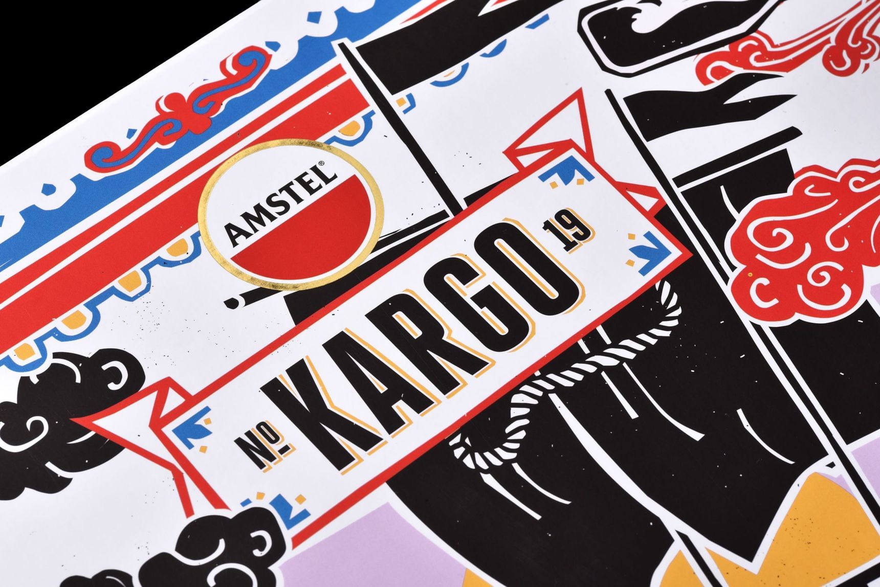
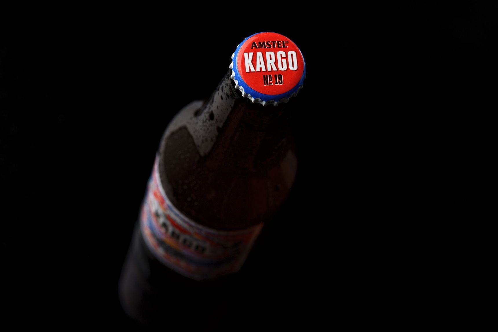
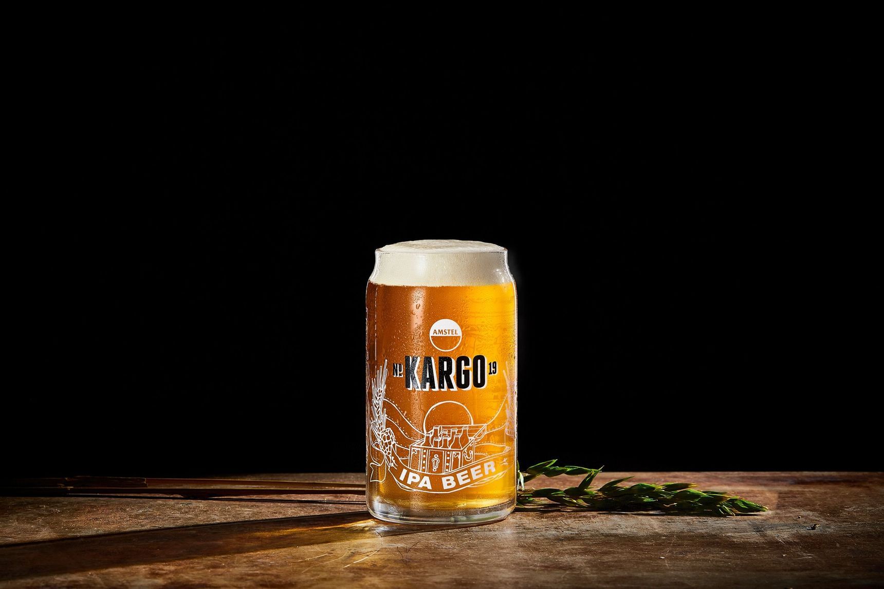
So we named it Kargo.
With a K instead of a C, because nothing real is flawless.


Creative direction
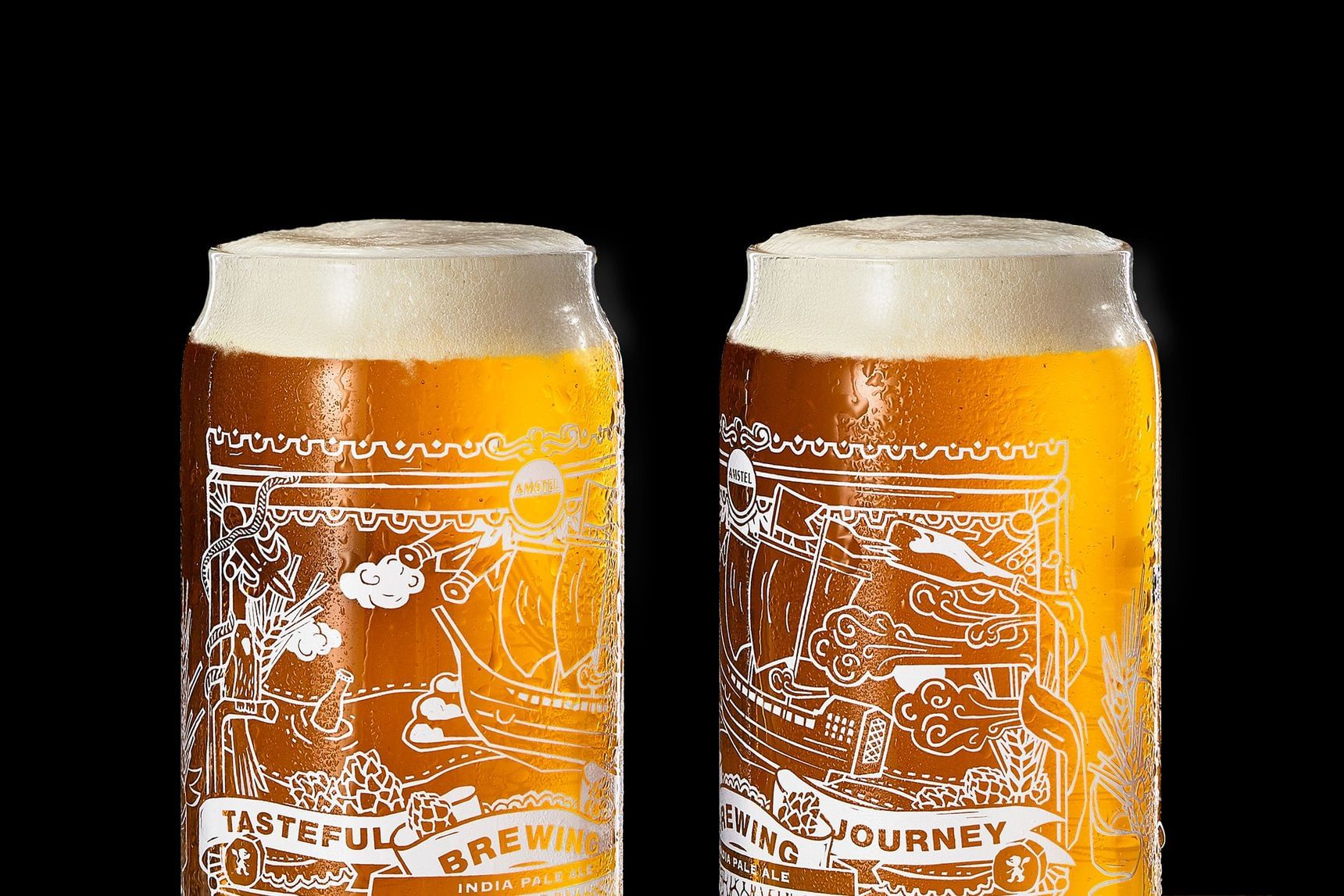
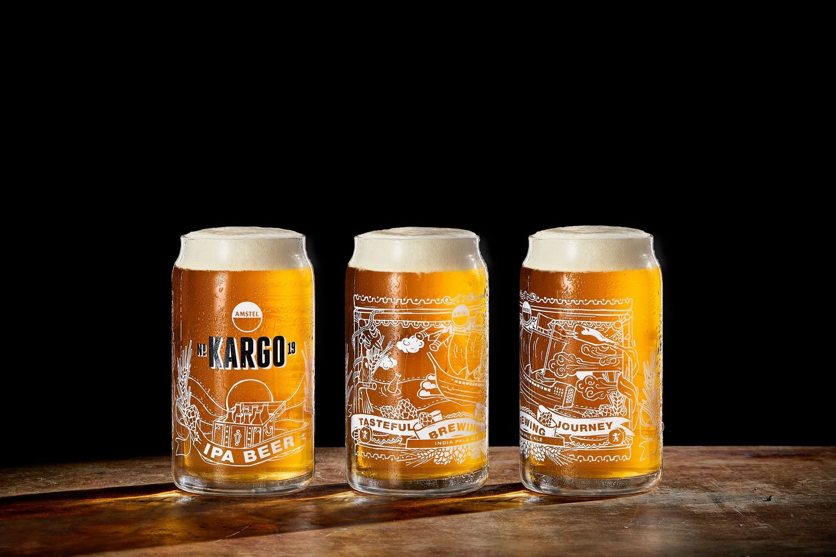
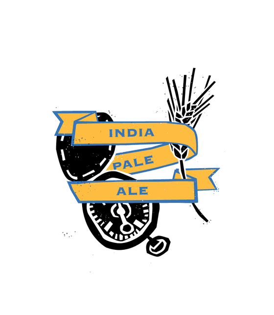
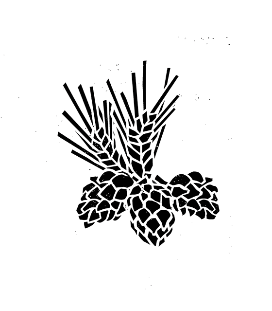
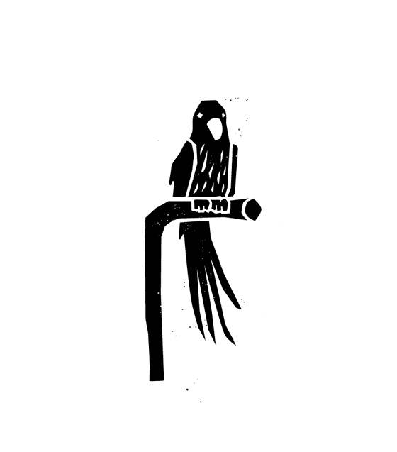
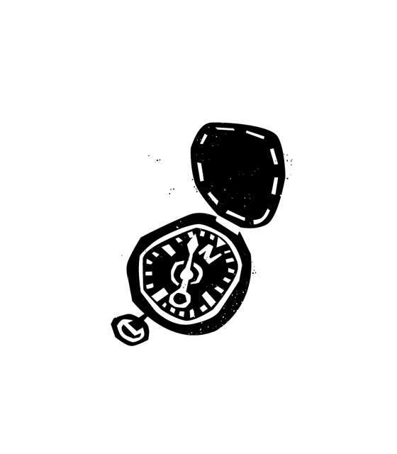
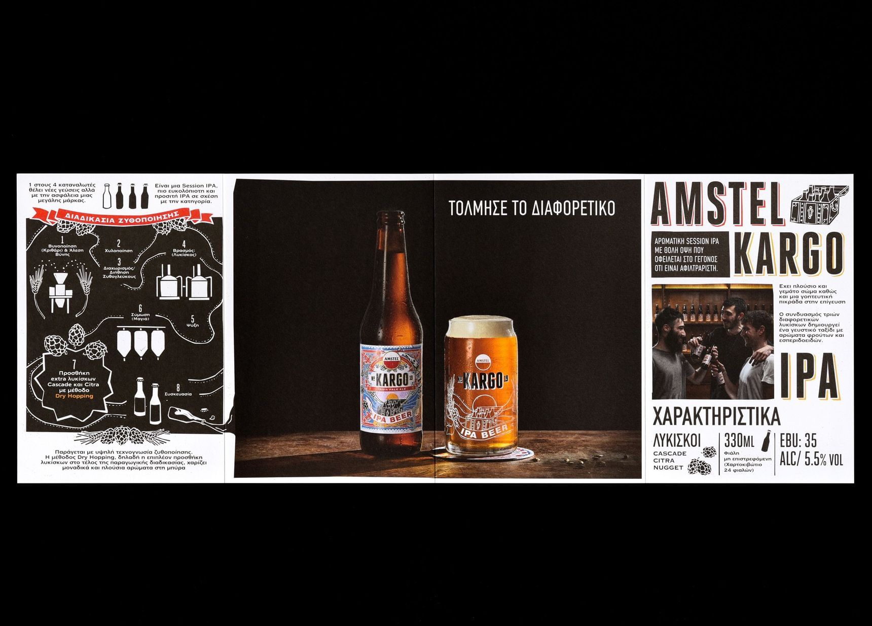
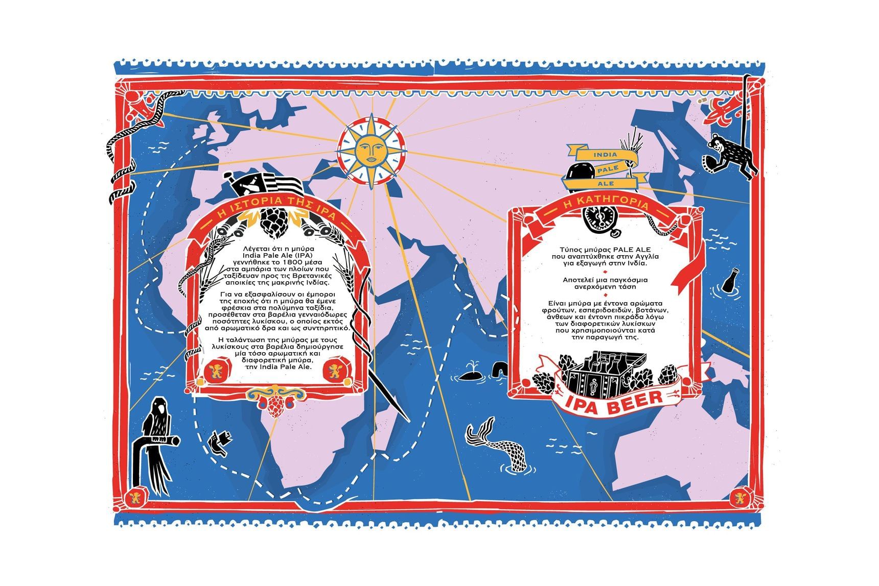
The unique aromas & the mysterious hazy appearance due to its unfiltered nature demanded an image that would convey its authenticity and bold character in every single touch point of the brand with its audience. After taking a closer look at the culture, history, and myths around the IPA category, we decided that the key elements that we should focus on are Craftsmanship, Journey, Adventure and Hops (the distinctive ingredient).
Creative direction
The unique aromas & the mysterious hazy appearance due to its unfiltered nature demanded an image that would convey its authenticity and bold character in every single touch point of the brand with its audience. After taking a closer look at the culture, history, and myths around the IPA category, we decided that the key elements that we should focus on are Craftsmanship, Journey, Adventure and Hops (the distinctive ingredient).
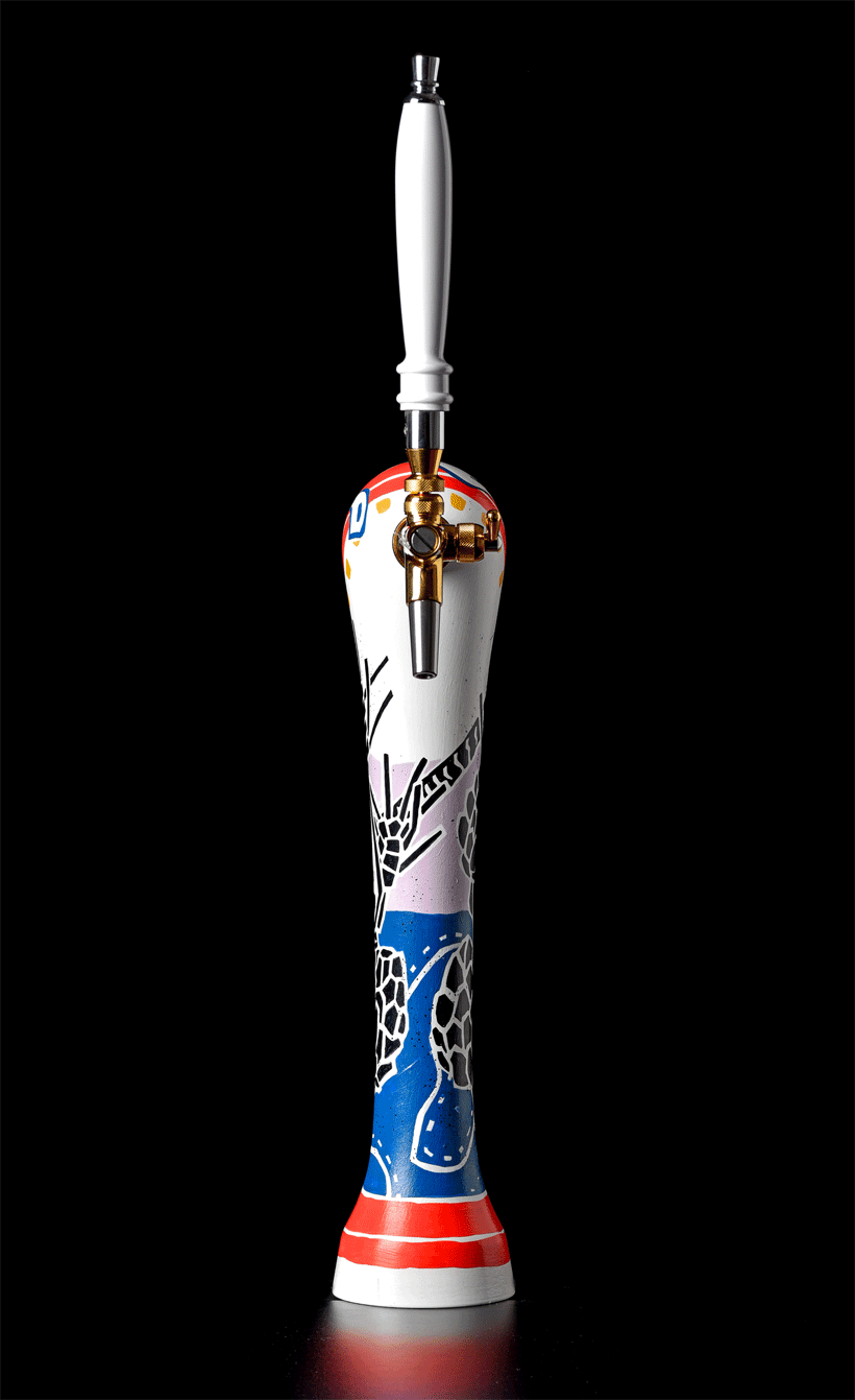
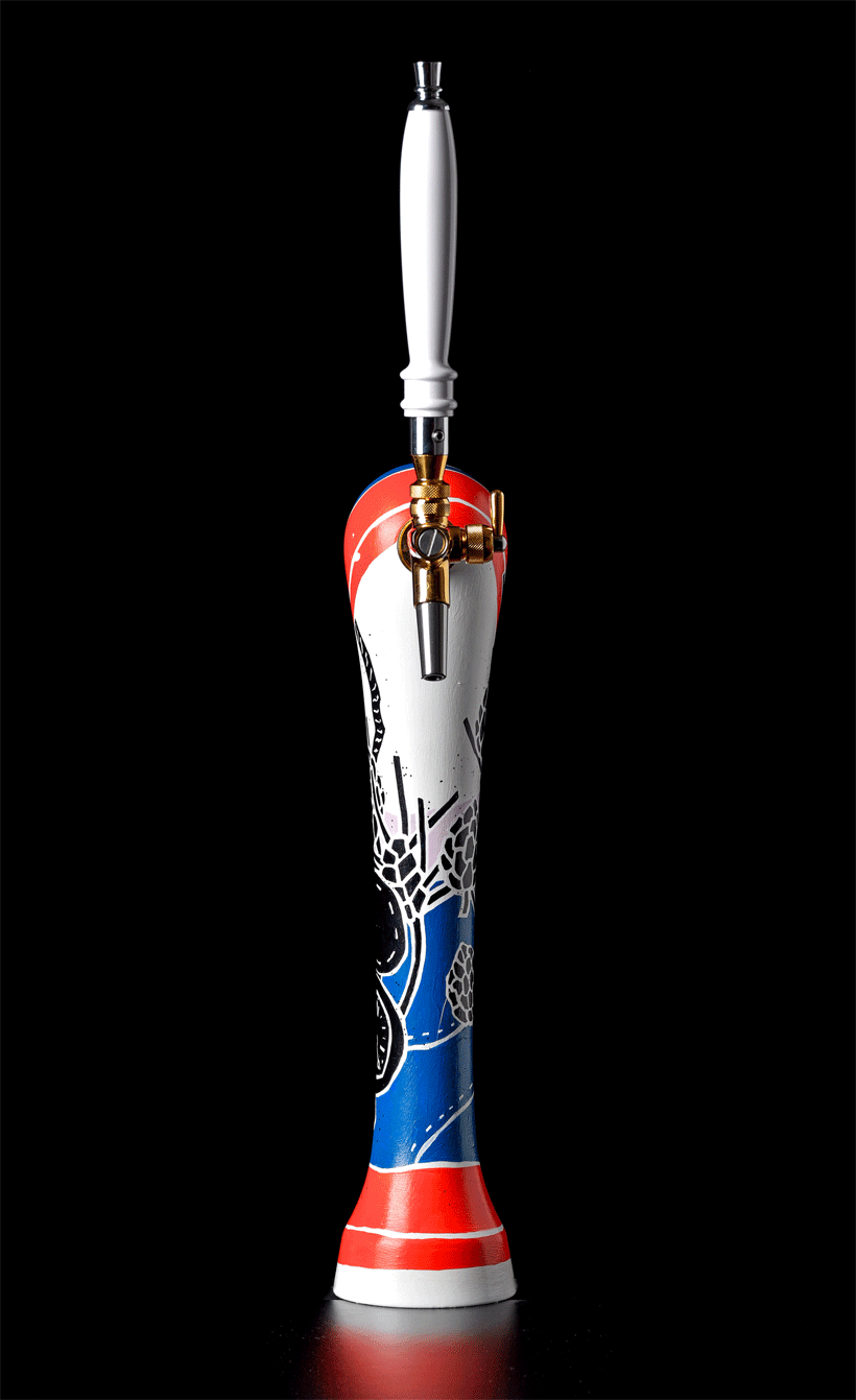
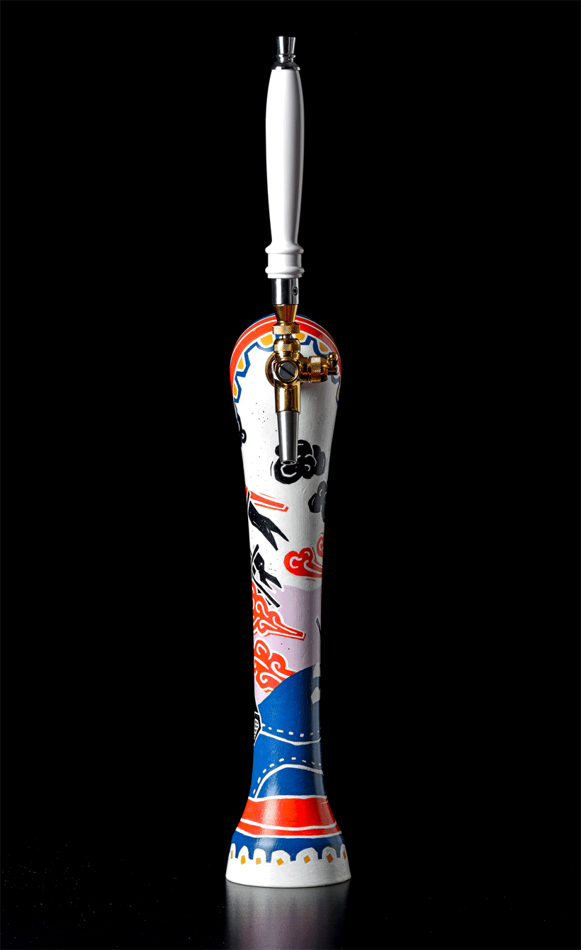
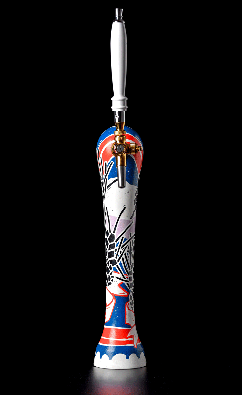
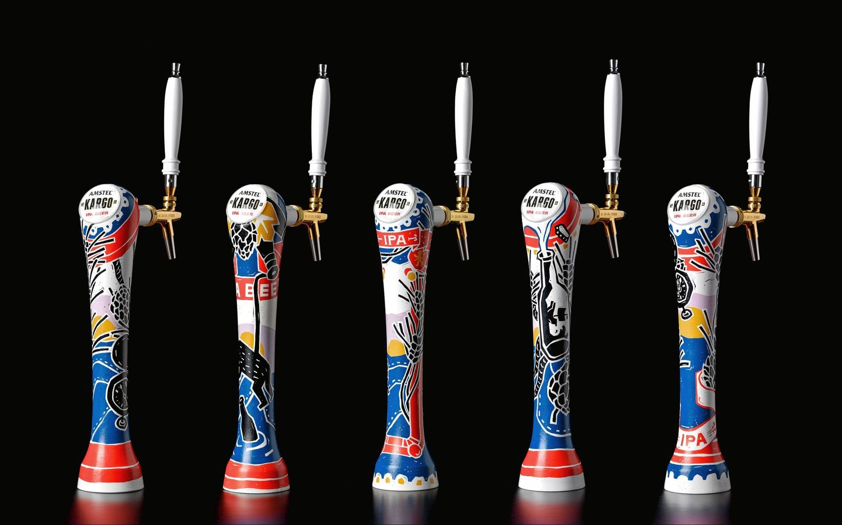
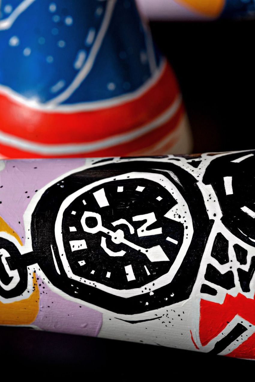
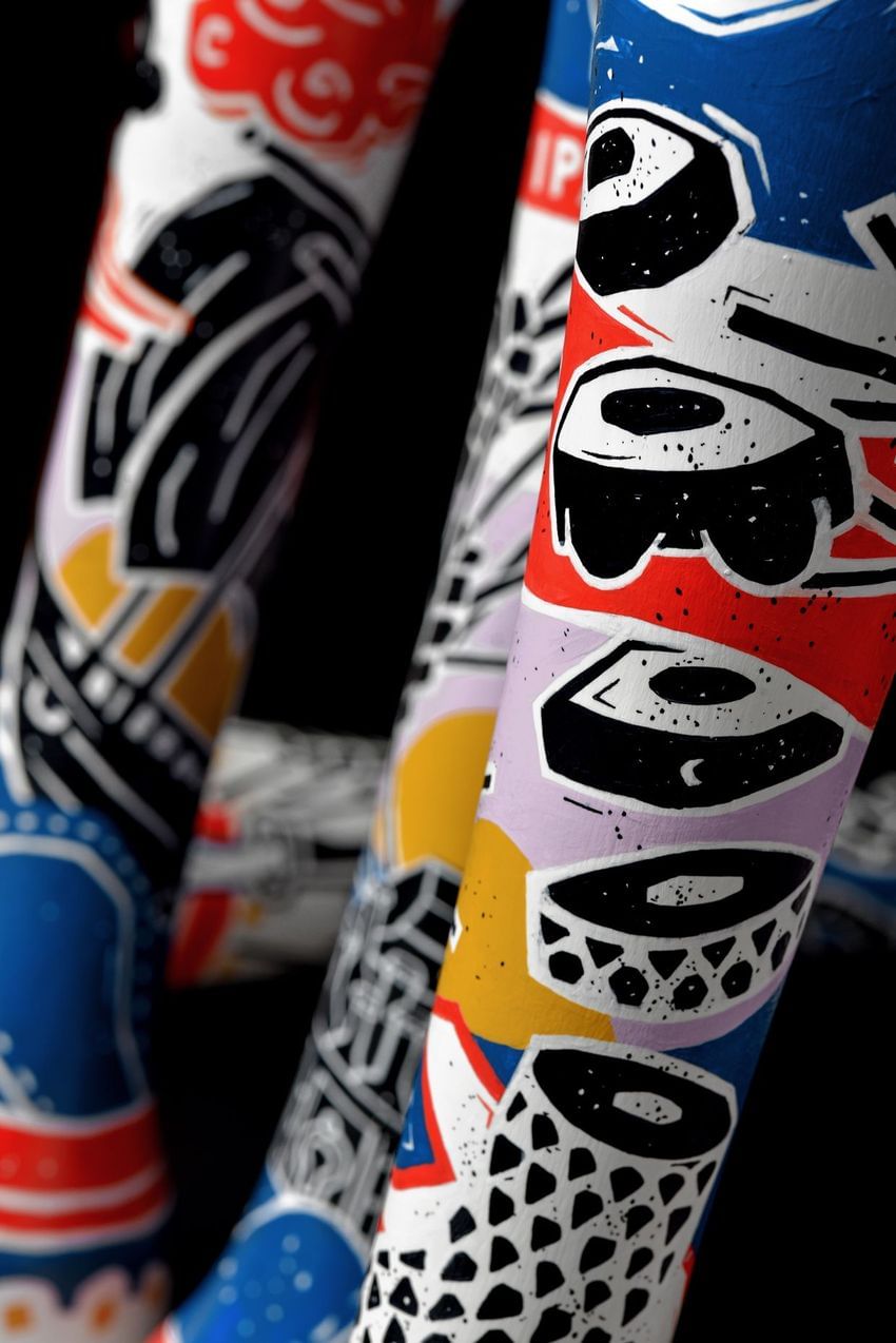
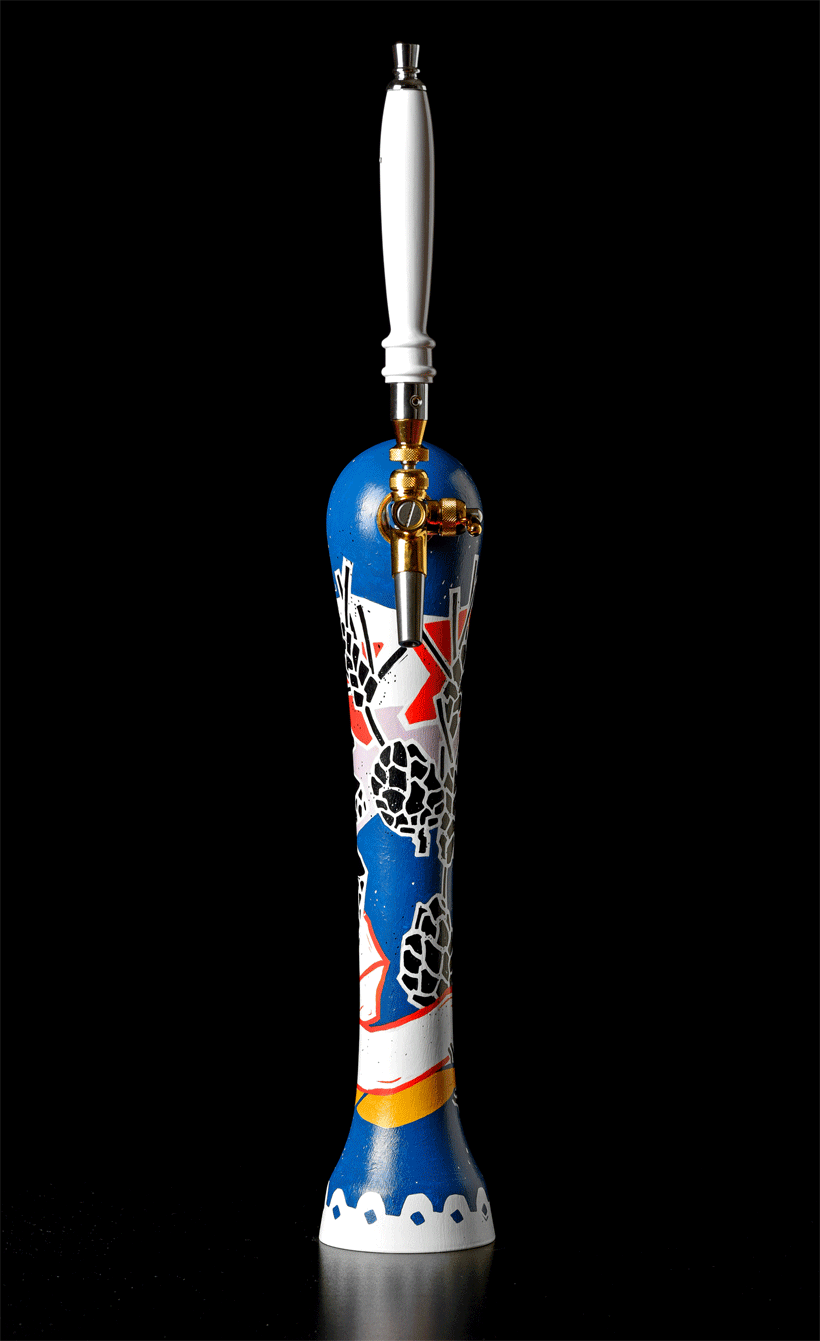
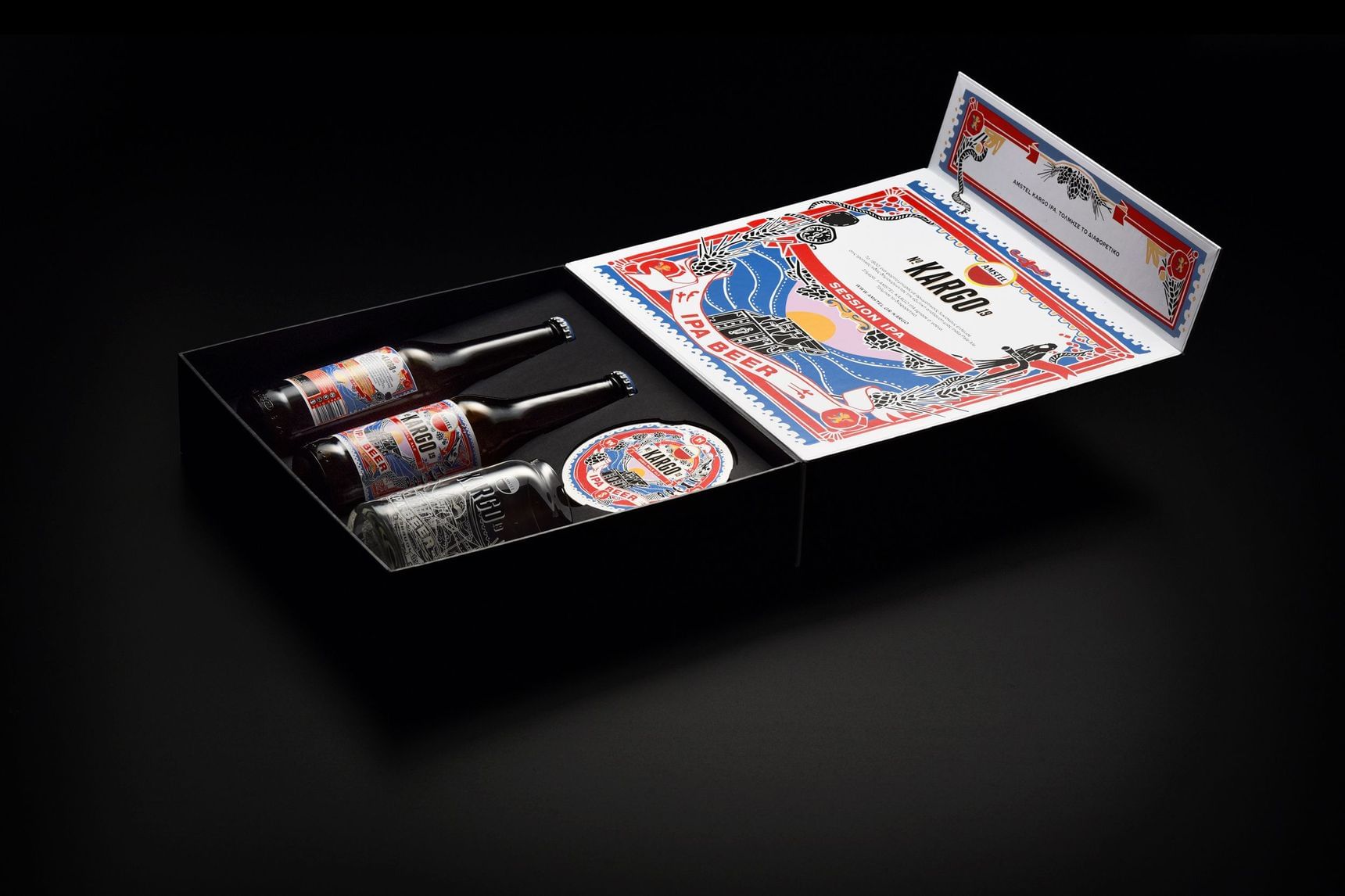
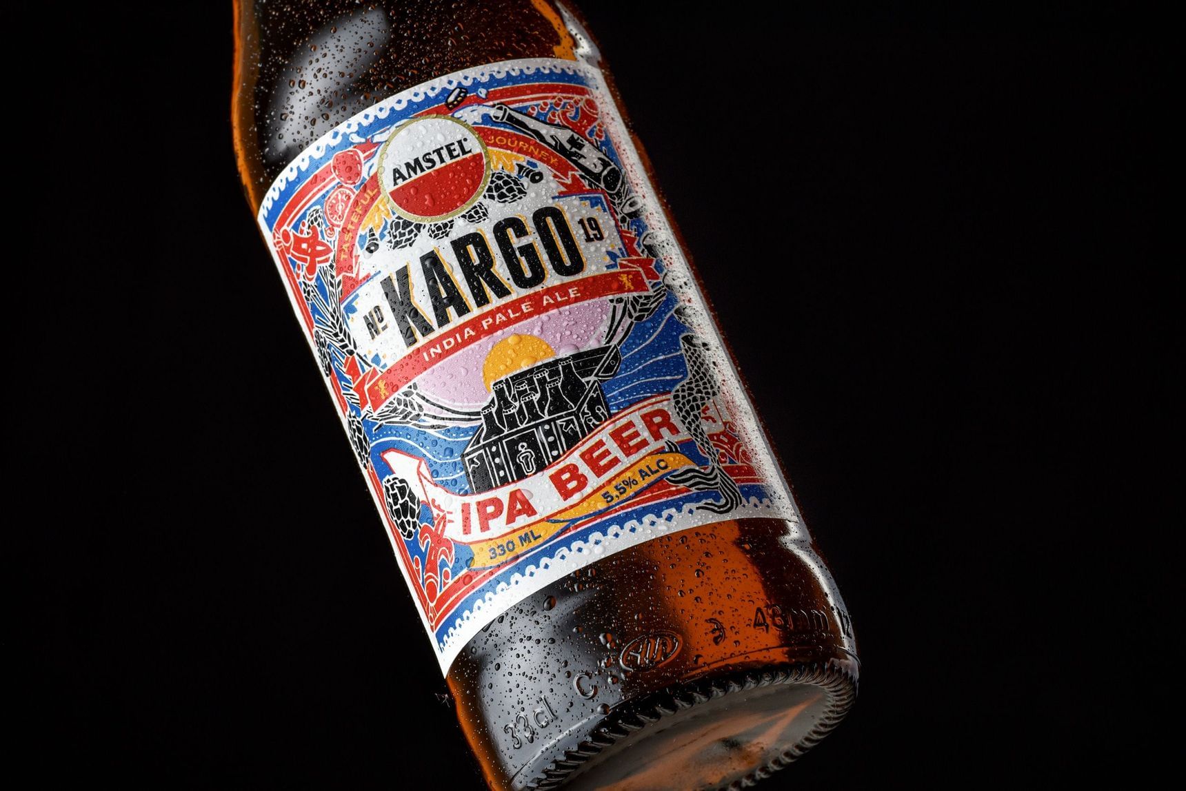
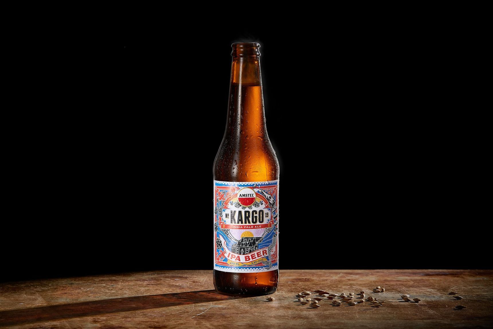
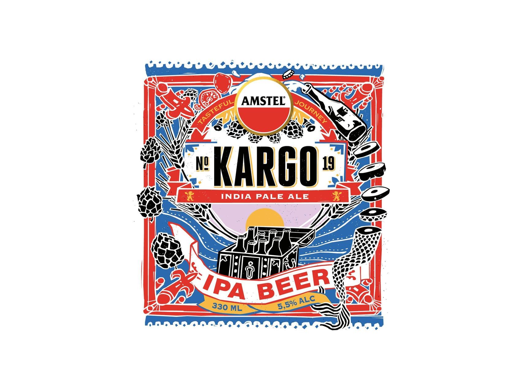
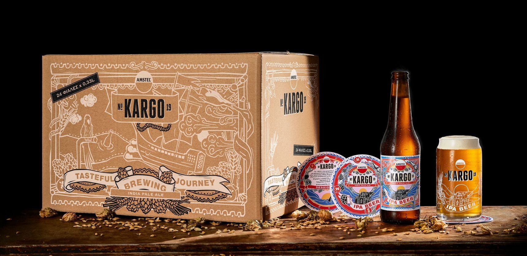
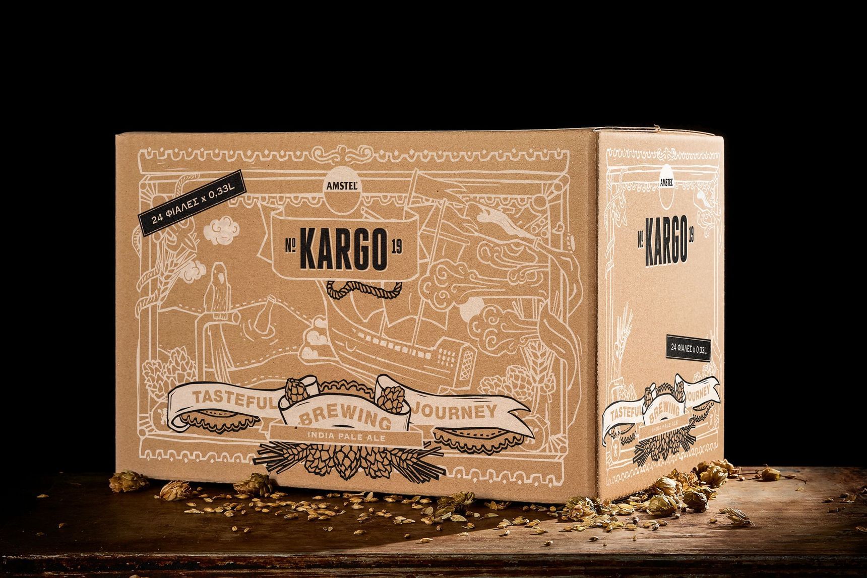
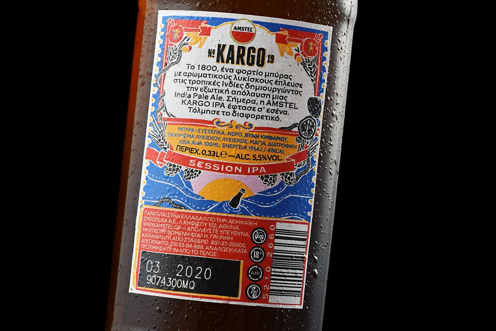
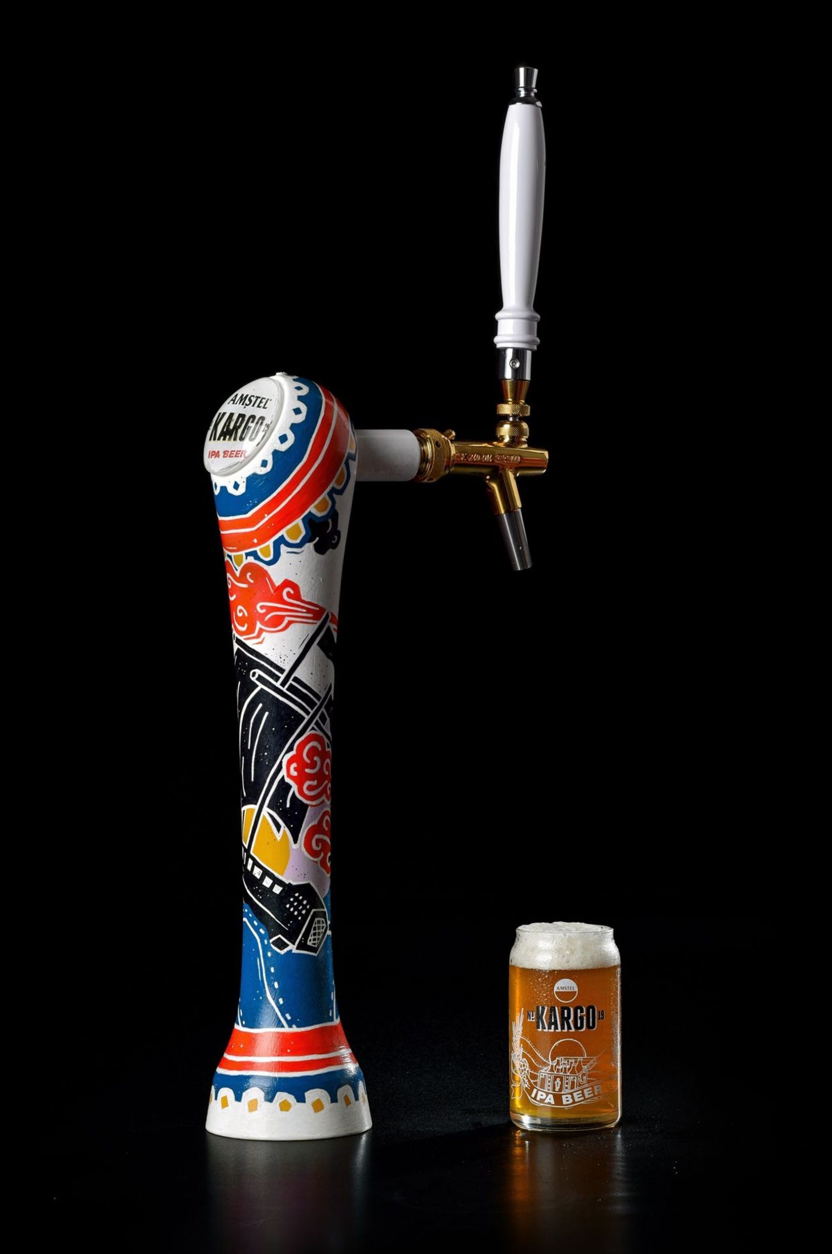
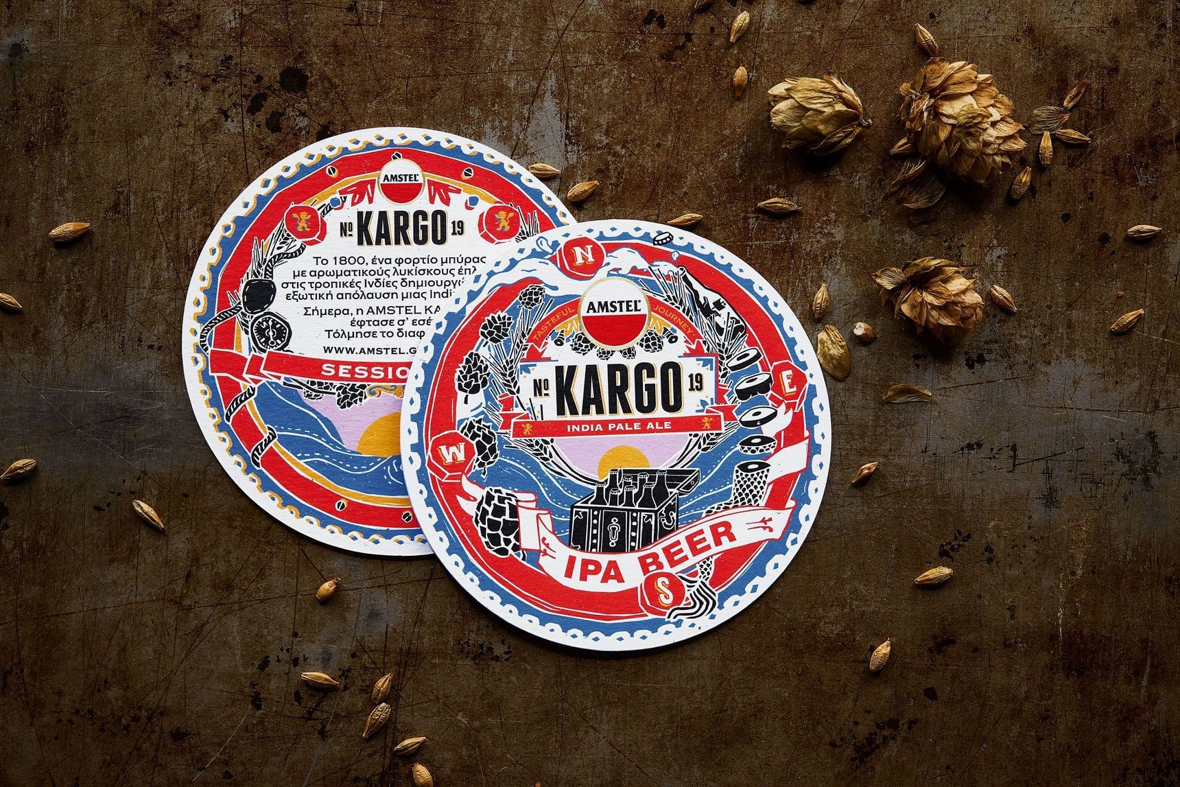
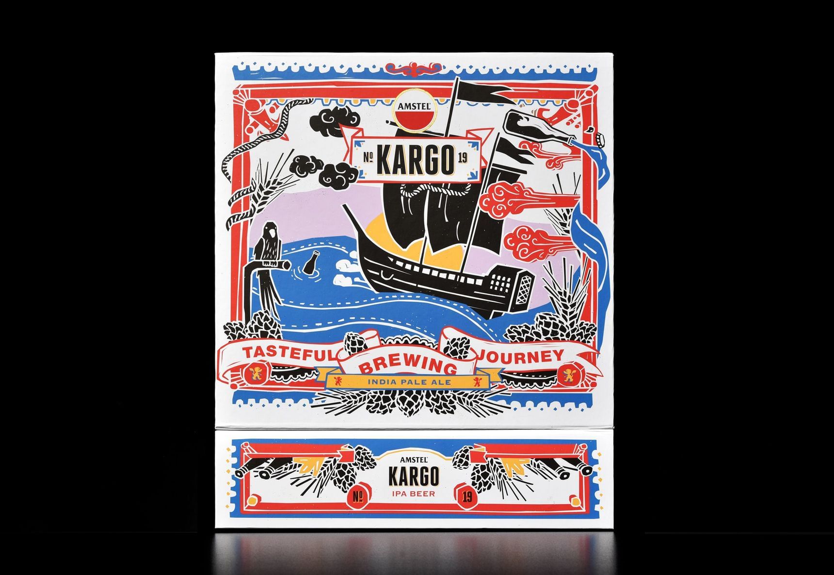
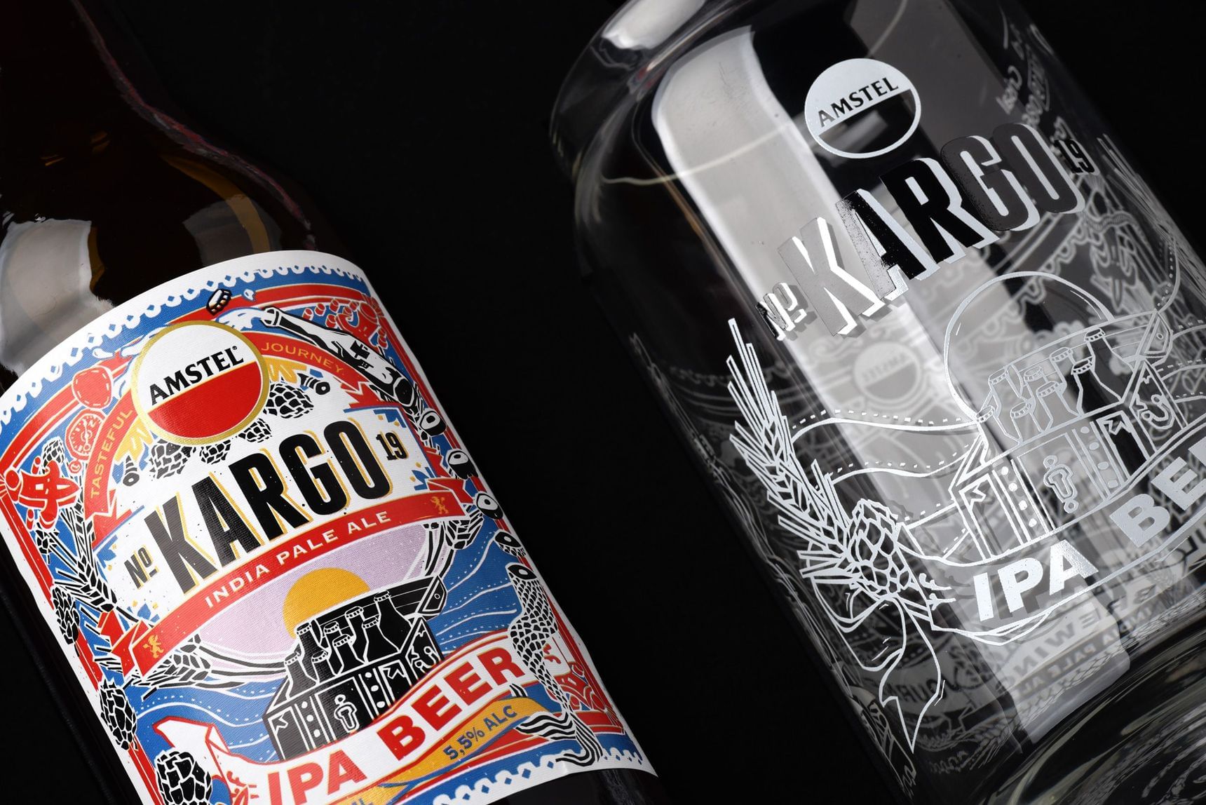
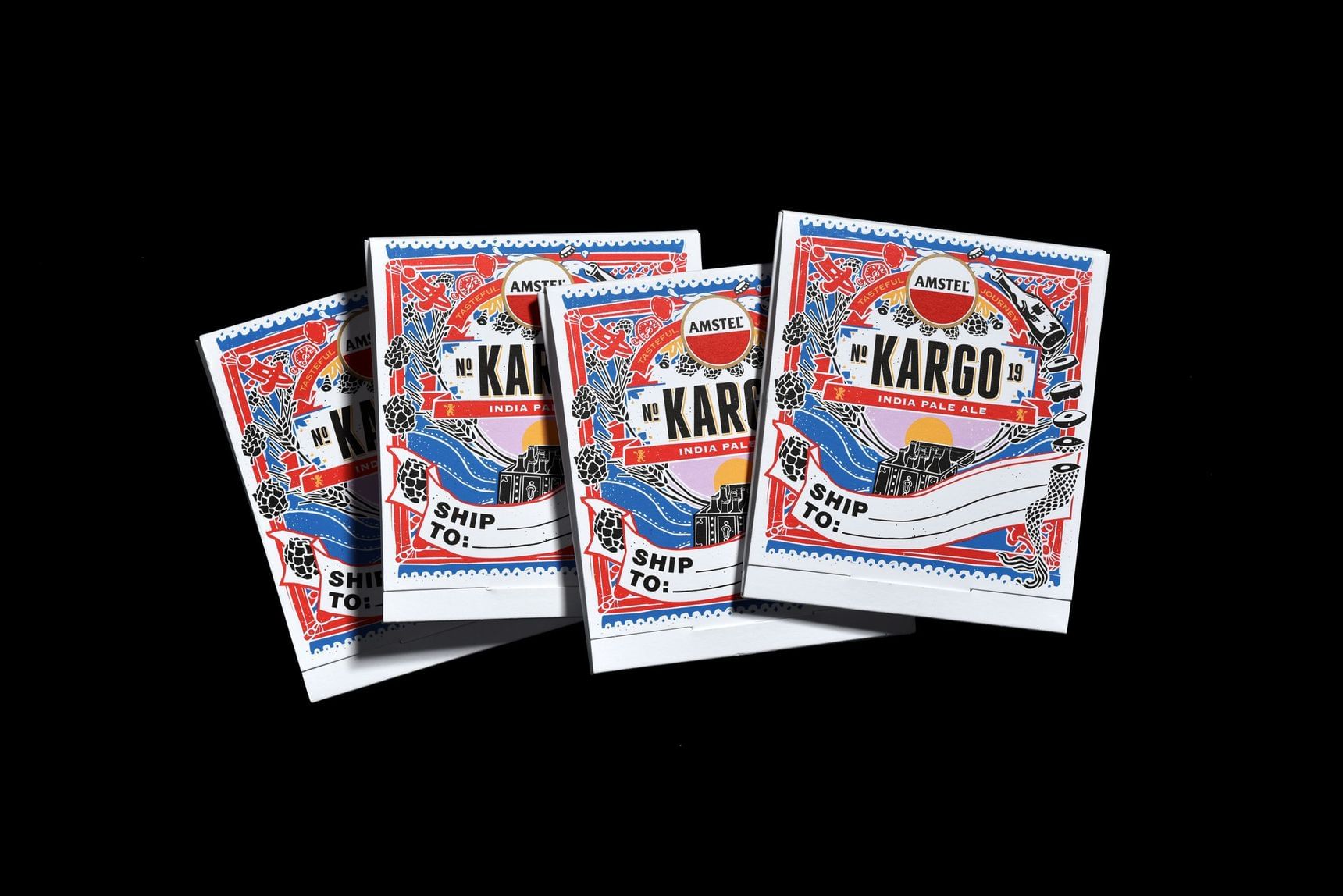
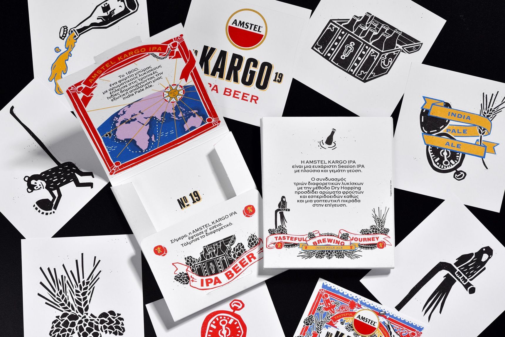
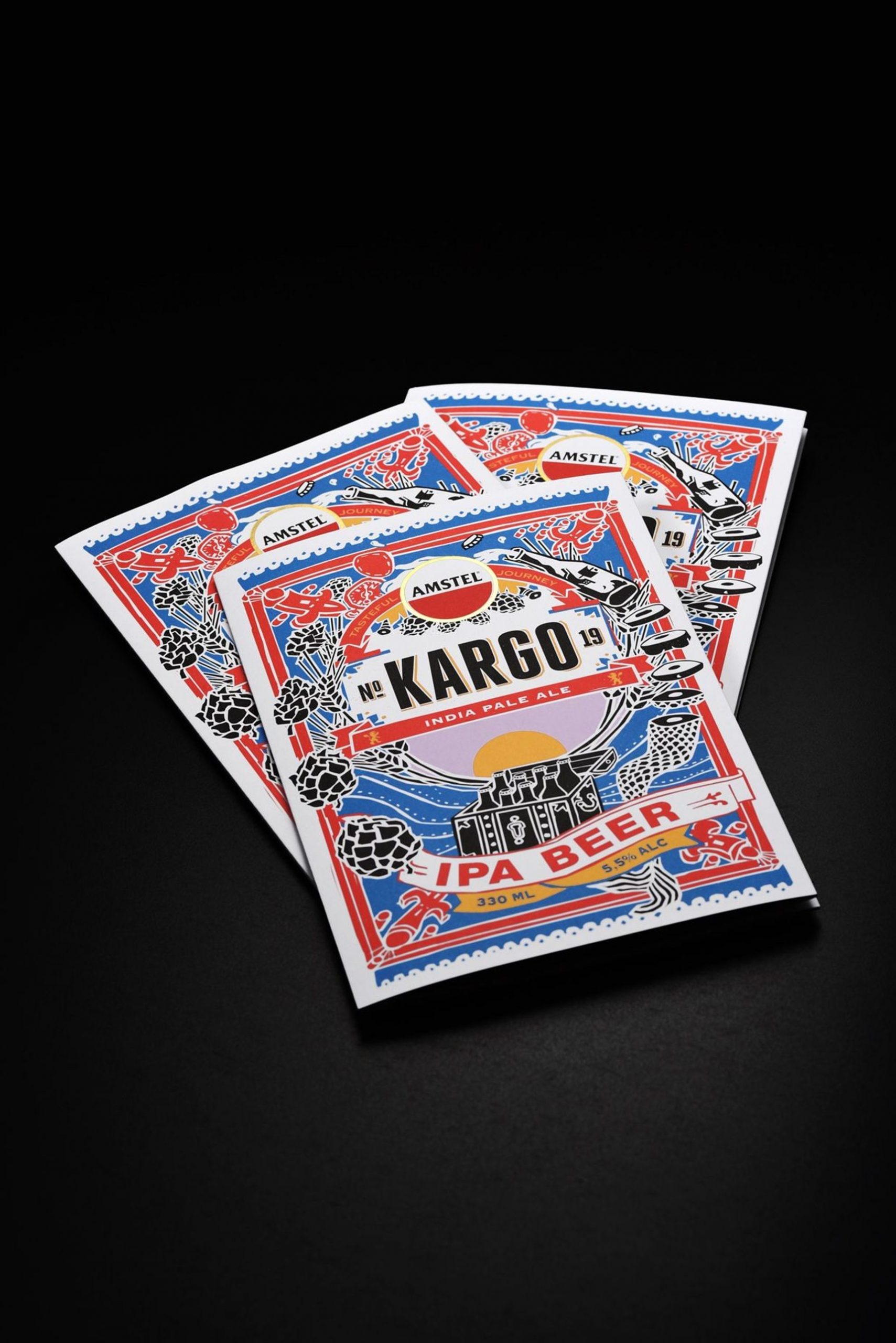
The packaging
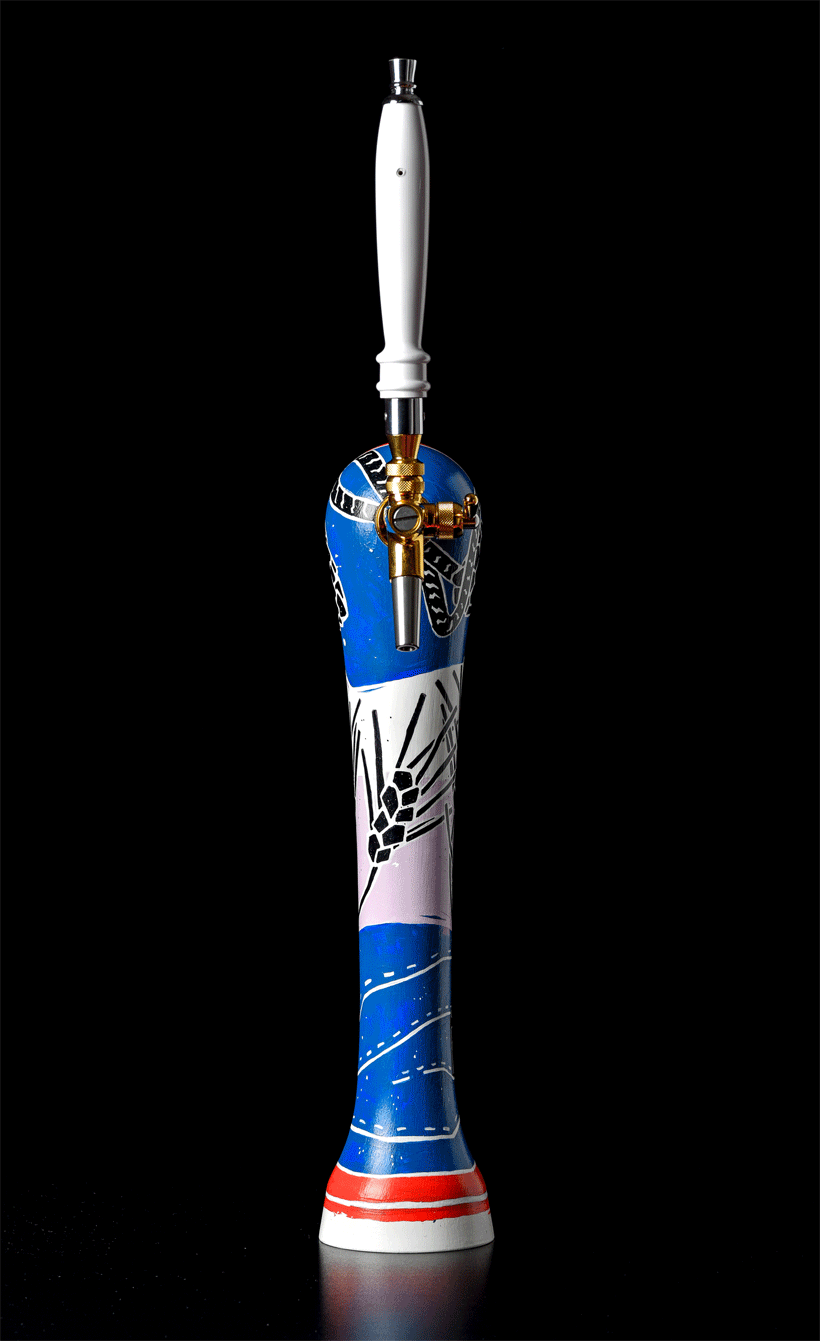
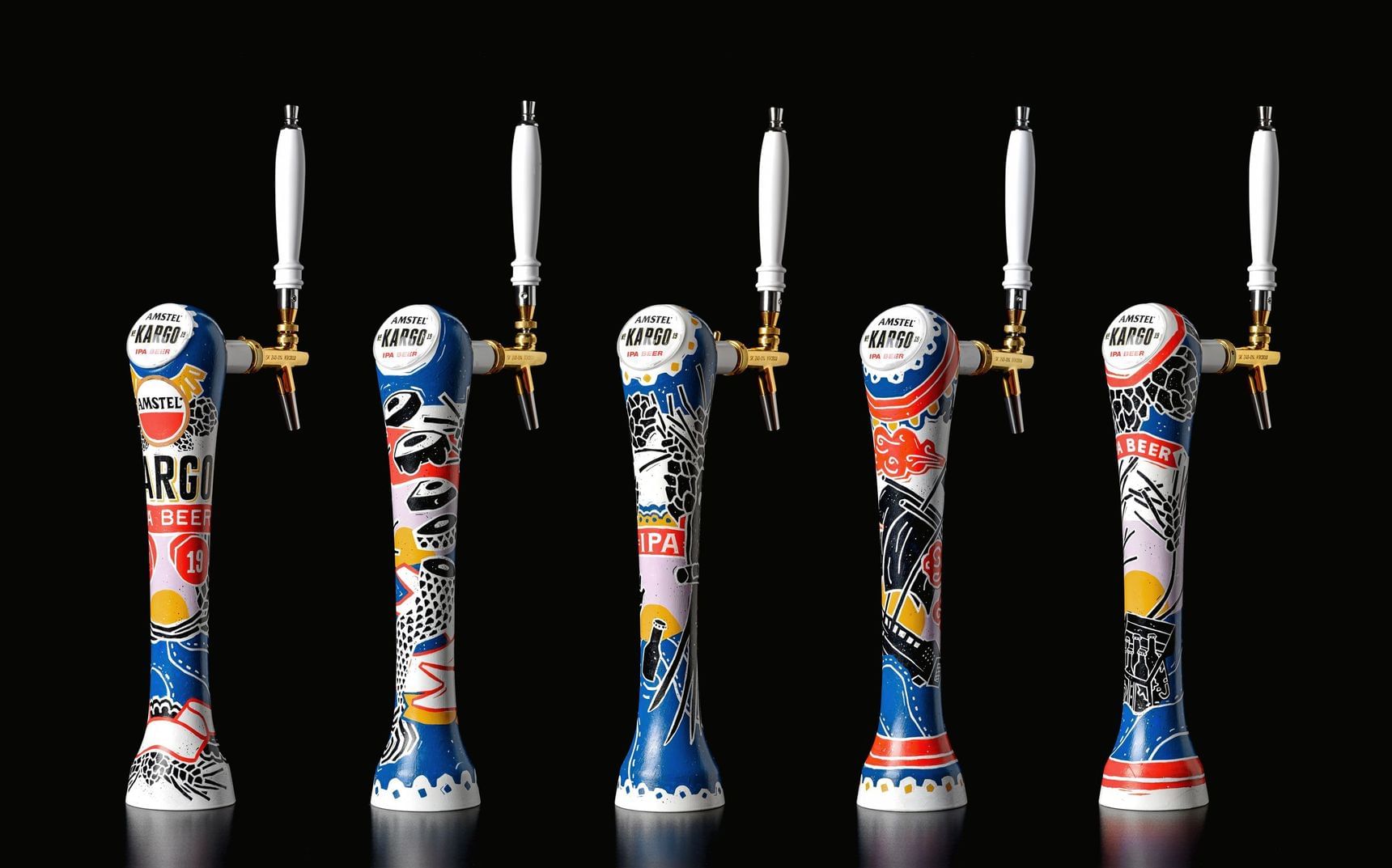
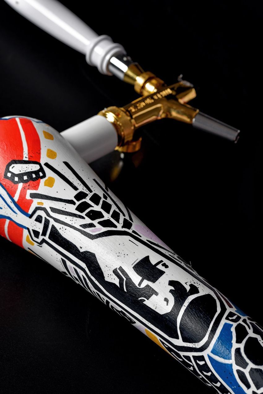
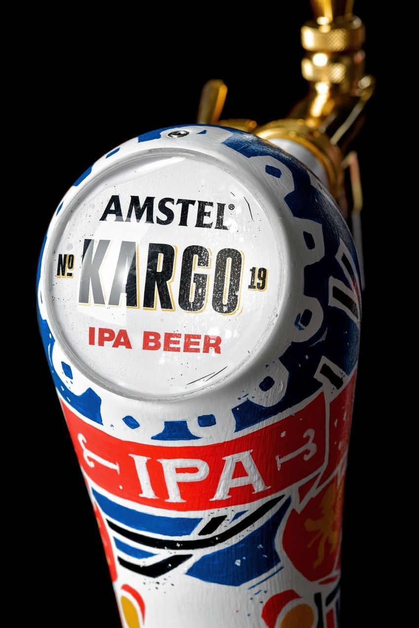
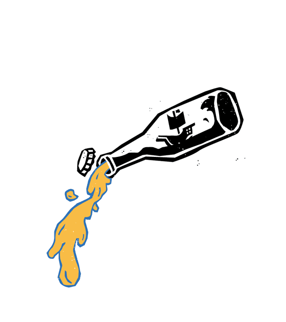
To depict the timeless need for adventure and discovery, we got our inspiration from the wood carving techniques that used to illustrate old naval tales. We chose high contrast main colors, Red (the passionate color of Amstel, the mother brand) and Blue (the color of the sea that adventurers have to cross in their quests). The illustrations were drawn as a fluid composition of symbols: from the ingredients to classical themes and symbols of pirate stories. In the middle of it: the precious cargo.
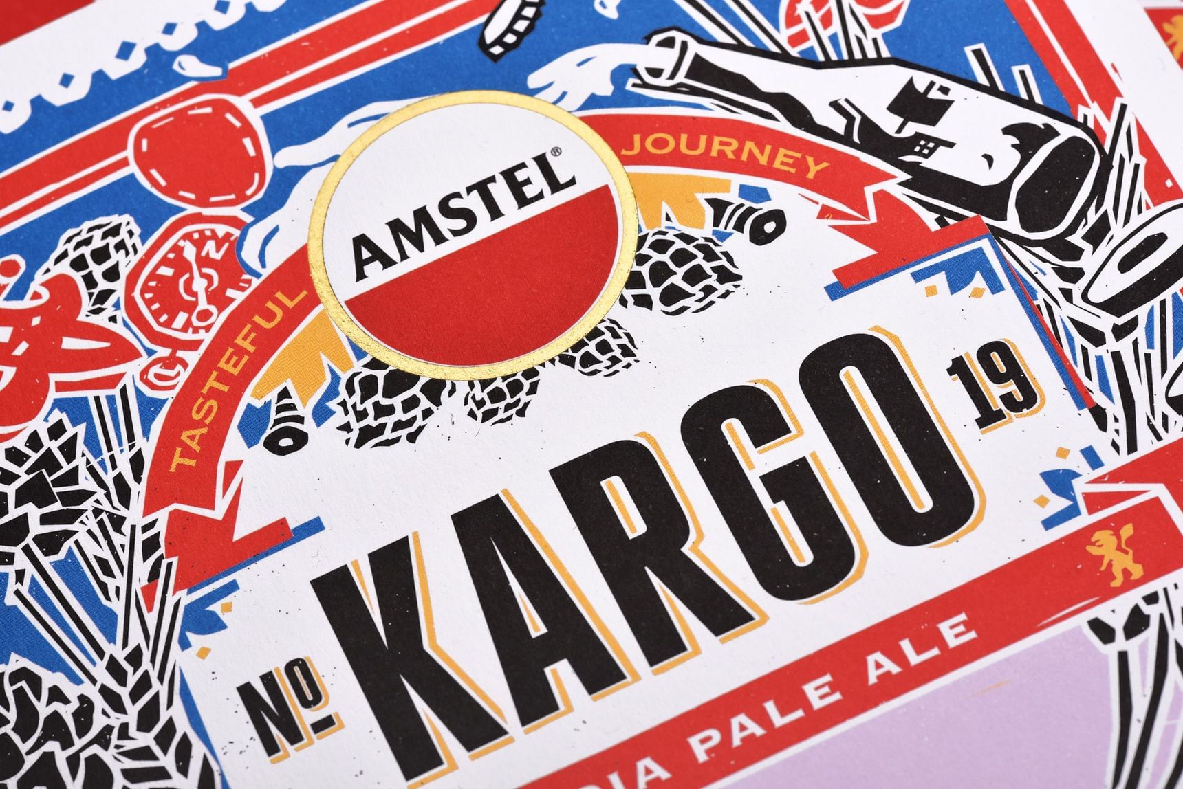
The name
We needed a name that surpassed labels and the two-dimensional surface of adventure. We wanted to show that this beer’s authenticity transcends how things look and that it’s all about the essence of what we truly are inside.

Credits
Brand name:
Paris Mexis
Photos (Packshots):
Theodosis Georgiadis, Konstantinos Gikas
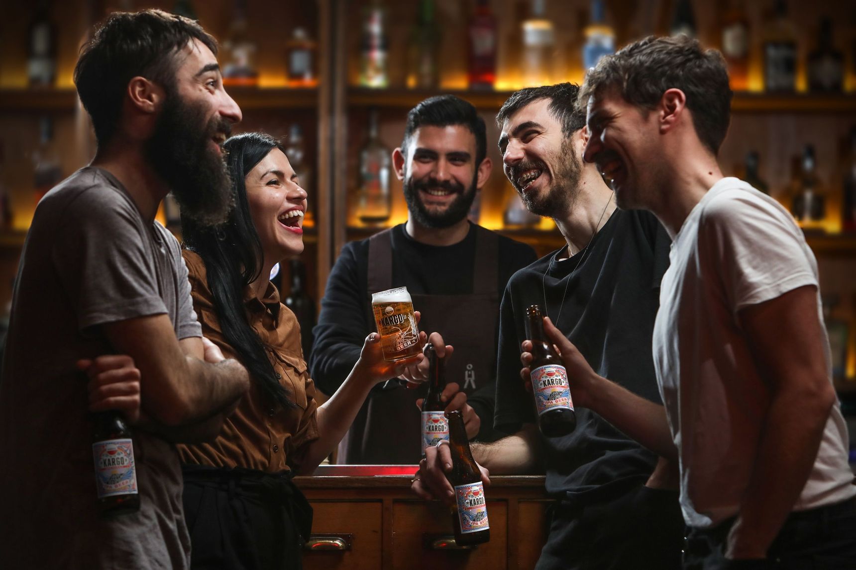
Photos (Occasional drinking):
Math studio
Sampling kit / Printing & production:
La Petite Jumelle
Stickers / Printing & production:
Fotolio SA